TCP #81: Making Interactive Dashboards Actually Interactive
A comprehensive guide to optimizing Amazon QuickSight for enterprise performance
You can also read my newsletters from the Substack mobile app and be notified when a new issue is available.
Last month, I audited 20+ QuickSight implementations across different industries.
The results were alarming: 80% of dashboards were taking 15+ seconds to load, and 40% of users were abandoning dashboards before they finished rendering.
The cost?
One client calculated they were losing $221K annually in productivity due to slow reporting.
Executives were making decisions based on outdated static reports because their "real-time" dashboards were too slow to use.
But here's the thing – most performance issues aren't data problems. They are architectural problems. And they're fixable.
Part 1: The SPICE Foundation
Why Direct Querying is Killing Your Performance
When you connect QuickSight directly to your data warehouse, every interaction becomes a database query.
A single dashboard with 8 visuals can trigger 50+ queries during load. Each filter change, each drill-down, and each refresh hits your database.
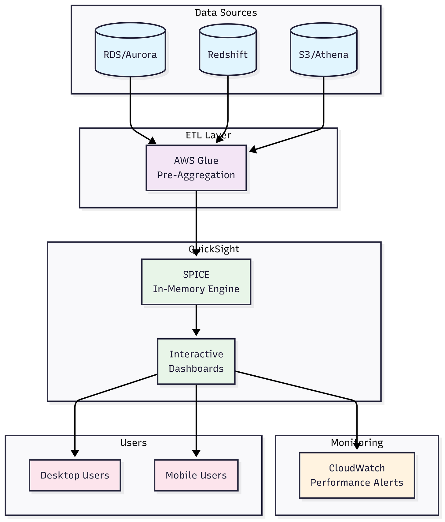
The SPICE Solution: Amazon's Super-fast, Parallel, In-memory Calculation Engine (SPICE) pre-loads your data into optimized columnar storage. Instead of querying your warehouse, QuickSight queries memory.
Implementation Strategy:
Immediate wins: Start with your most-used dashboards
Data sizing: SPICE handles up to 500M rows per dataset (more than enough for 90% of use cases)
Cost consideration: At $0.38 per GB/month, even a 100GB dataset costs $38/month vs. thousands in query costs
Edge Cases to Watch:
Real-time data requirements (under 15-minute latency)
Datasets exceeding 500M rows
Highly dimensional data with sparse matrices
For these scenarios, implement hybrid approaches: SPICE for historical data, direct query for real-time metrics.
Part 2: Strategic Pre-Aggregation
Beyond SPICE: Handling Massive Datasets
When you hit SPICE limits, the solution isn't to go back to direct querying. It's to get smarter about your data architecture.
The Aggregation Hierarchy:
Transactional Level: Raw data for drill-downs (sample 10-20%)
Daily Aggregates: 90% of your reporting needs
Weekly/Monthly: Executive summaries
Yearly: Strategic planning views
Implementation Pattern:
-- Daily aggregates table
CREATE TABLE daily_metrics AS
SELECT
    date_trunc('day', timestamp) as date,
    product_category,
    region,
    SUM(revenue) as total_revenue,
    COUNT(distinct customer_id) as unique_customers,
    AVG(order_value) as avg_order_value
FROM transactions
GROUP BY 1,2,3;
Advanced Techniques:
Incremental Processing: Only aggregate new data since the last run
Smart Partitioning: Partition by date and frequently filtered dimensions
Calculated Fields Migration: Move complex calculations to the ETL pipeline
Real-World Impact: One client reduced their executive dashboard load time from 2 minutes to 8 seconds by implementing a 3-tier aggregation strategy. Their data volume didn't change – their approach did.
Part 3: Visual Optimization Strategies
The Hidden Cost of Table Visuals
Table visuals are performance killers. They force QuickSight to render every row, apply formatting to every cell, and maintain sort state for every column.
Performance Hierarchy (fastest to slowest):
KPI Tiles: Single aggregated value
Bar/Line Charts: Optimized rendering engine
Pivot Tables: Efficient for cross-tabulations
Scatter Plots: Good for correlation analysis
Tables: Last resort only
Optimization Strategies:
Pagination: Limit table displays to 100 rows max
Conditional Formatting: Use sparingly (adds 20-30% load time)
Custom Calculations: Move to dataset level, not visual level
The 80/20 Rule: 80% of users look at the same 20% of data. Design your visuals to highlight these insights prominently, then provide drill-down capabilities for the remaining 20%.
Part 4: Filter Architecture That Scales
The Cascade Effect
Most teams add filters to individual visuals. This creates a multiplicative query problem – each visual query is independent, even when showing related data.
Dashboard-Level Filter Strategy:
Primary Filters: Date range, region, product category
Secondary Filters: Cascade from primary selections
Tertiary Filters: Specific to individual visuals only when necessary
Filter Performance Hierarchy:
Date filters: Usually, most selective, put first
Categorical filters: Region, department, product line
Numeric filters: Revenue ranges, quantity thresholds
Text filters: Avoid if possible, use dropdowns instead
Advanced Filtering Techniques:
Default Selections: Pre-filter to current month/quarter
Relative Date Filters: "Last 30 days" vs. specific date ranges
Conditional Cascading: Show relevant options only
Implementation Example: Instead of 5 separate region filters across visuals, use one dashboard-level region filter. Load time drops from 45 seconds to 12 seconds with this change alone.
Part 5: The Parameter Optimization Pattern
Dynamic Scenarios Without Performance Penalties
Calculated fields that change based on user selections create query complexity. Parameters solve this by switching entire datasets rather than recalculating on the fly.
Traditional Approach (Slow):
-- Calculated field in QuickSight
IF({Period Parameter}="MTD", {MTD_Sales},
   IF({Period Parameter}="QTD", {QTD_Sales}, {YTD_Sales}))
Optimized Approach (Fast): Pre-calculate all scenarios in your ETL pipeline:
-- In your data warehouse
SELECT
    date, product, region,
    'MTD' as period_type,
    mtd_sales as sales_value
FROM mtd_aggregates
UNION ALL
SELECT
    date, product, region,
    'QTD' as period_type,
    qtd_sales as sales_value
FROM qtd_aggregates
Then use parameters to filter the dataset, not calculate within QuickSight.
Advanced Parameter Patterns:
Metric Switching: Revenue vs. Units vs. Profit
Time Period Comparison: Current vs. Previous period
Scenario Planning: Budget vs. Actual vs. Forecast
Part 6: Data Source Connection Optimization
Database-Specific Strategies
Amazon Redshift:
Connection Pooling: Set max connections to 50-100
WLM Configuration: Create a dedicated queue for QuickSight
Compression: Use ZSTD for newer clusters
Sort Keys: Align with your most common filter patterns
RDS/Aurora:
Read Replicas: Dedicated reporting instance
Connection Limits: Monitor and set appropriate limits
Query Optimization: Use EXPLAIN PLAN for slow queries
S3/Athena:
Partitioning Strategy: Partition by date and high-cardinality dimensions
File Format: Parquet with SNAPPY compression
Query Optimization: Use appropriate projection for your use case
Connection Management Best Practices:
Schedule refreshes during low-traffic periods
Implement connection retry logic
Monitor connection pool utilization
Set appropriate timeout values (300s for large datasets)
Part 7: Refresh Strategy That Prevents Chaos
The Scheduling Sweet Spot
Refresh Frequency Framework:
Transactional Data: Hourly incremental
Dimension Tables: Daily full refresh
Historical Data: Weekly full refresh
Archive Data: Monthly or quarterly
Incremental Refresh Implementation:
-- Incremental refresh query
SELECT * FROM sales_data
WHERE modified_date >= {last_refresh_timestamp}
OR created_date >= {last_refresh_timestamp}
Advanced Scheduling Strategies:
Staggered Refreshes: Spread load across time windows
Dependency Management: Refresh dimension tables before fact tables
Failure Recovery: Implement retry logic with exponential backoff
Monitoring: Set up CloudWatch alarms for refresh failures
Edge Case Handling:
Data Corrections: How to handle retroactive changes
Timezone Considerations: UTC vs. local time refresh windows
Holiday Schedules: Automated adjustment for business calendars
Part 8: Mobile Performance Optimization
The 3-Second Rule
Mobile users abandon dashboards after 3 seconds. Desktop users give you 8 seconds. Your mobile strategy needs to be fundamentally different.
Mobile-First Design Principles:
Visual Limit: Maximum 6 visuals per dashboard
Hierarchy: Most important metrics at the top
Interaction: Touch-friendly filter controls
Loading: Progressive loading with skeleton screens
Technical Optimizations:
Responsive Layouts: Use QuickSight's mobile-optimized themes
Image Optimization: Compress and resize appropriately
Caching: Leverage browser caching for static elements
Network Sensitivity: Graceful degradation for poor connections
Testing Strategy:
Test on actual devices, not desktop browser resizing
Use different network conditions (3G, 4G, WiFi)
Monitor real user metrics, not synthetic tests
Part 9: Monitoring and Alerting
Proactive Performance Management
CloudWatch Metrics to Track:
Dashboard Load Time: Alert if > 5 seconds
Query Execution Time: Alert if > 10 seconds
SPICE Refresh Success Rate: Alert if < 95%
Concurrent User Count: Alert approaching limits
Custom Monitoring Implementation:
# CloudWatch custom metric
cloudwatch = boto3.client('cloudwatch')
cloudwatch.put_metric_data(
    Namespace='QuickSight/Performance',
    MetricData=[
        {
            'MetricName': 'DashboardLoadTime',
            'Value': load_time_ms,
            'Unit': 'Milliseconds',
            'Dimensions': [
                {
                    'Name': 'DashboardId',
                    'Value': dashboard_id
                }
            ]
        }
    ]
)
Alert Thresholds:
Critical: Load time > 15 seconds
Warning: Load time > 8 seconds
Info: Load time > 5 seconds
Response Playbook:
Immediate: Check SPICE refresh status
Short-term: Analyze slow queries
Long-term: Review data architecture
Part 10: Advanced Optimization Techniques
Enterprise-Level Strategies
ML-Powered Insights:
Use QuickSight's ML capabilities for forecasting instead of complex calculated fields
Implement anomaly detection to reduce manual analysis
Leverage natural language queries for ad-hoc analysis
Row-Level Security (RLS) Optimization:
-- Efficient RLS mapping table
CREATE TABLE user_access_mapping AS
SELECT DISTINCT
    user_email,
    region,
    department,
    access_level
FROM user_permissions;
API-Driven Optimization:
Automate dashboard creation for consistent performance
Implement dynamic embedding with session capacity
Use APIs for bulk operations and monitoring
Advanced Caching Strategies:
Query Result Caching: Cache frequently accessed queries
Visual-Level Caching: Cache expensive calculations
Session-Level Caching: Maintain user context
Your Performance Optimization Checklist
Week 1: Foundation
Audit the current dashboard performance
Identify the top 5 most valuable dashboards
Migrate critical dashboards to SPICE
Implement basic CloudWatch monitoring
Week 2: Architecture
Design an aggregation strategy for large datasets
Optimize filter hierarchy
Replace table visuals with optimized charts
Set up incremental refresh schedules
Week 3: Advanced Optimization
Implement parameter-based dynamic scenarios
Optimize data source connections
Set up comprehensive monitoring
Create mobile-optimized versions
Week 4: Enterprise Features
Implement efficient RLS
Set up automated monitoring alerts
Create performance baseline metrics
Document optimization playbook
Measuring Success
Key Performance Indicators:
Dashboard Load Time: Target < 5 seconds
User Engagement: Time spent in dashboards
Query Success Rate: Target > 99%
Mobile Usage: Percentage of mobile users
Business Impact Metrics:
Decision Speed: Time from question to insight
User Adoption: Active dashboard users
Cost Reduction: Query cost savings
Productivity Gains: Hours saved per week
Final Thoughts
The difference between fast and slow dashboards isn't just user experience – it's business impact. Fast dashboards drive better decisions, higher adoption, and measurable ROI.
Start with your most critical dashboard. Implement SPICE, optimize your filters, and monitor the results. Most teams see 5-10x performance improvements within the first week.
That’s it for today!
Did you enjoy this newsletter issue?
Share with your friends, colleagues, and your favorite social media platform.
Until next week — Amrut
Get in touch
You can find me on LinkedIn or X.
If you would like to request a topic to read, please feel free to contact me directly via LinkedIn or X.


